THE ESSENCE AS A STARTING POINT
Client
SNTIALS
Year
2026
For SNTIALS, I developed a full brand identity for an outdoor brand built on function, simplicity and performance. From logo to visual system, everything centres on the essence of the outdoors.
Services
THE CLIENT
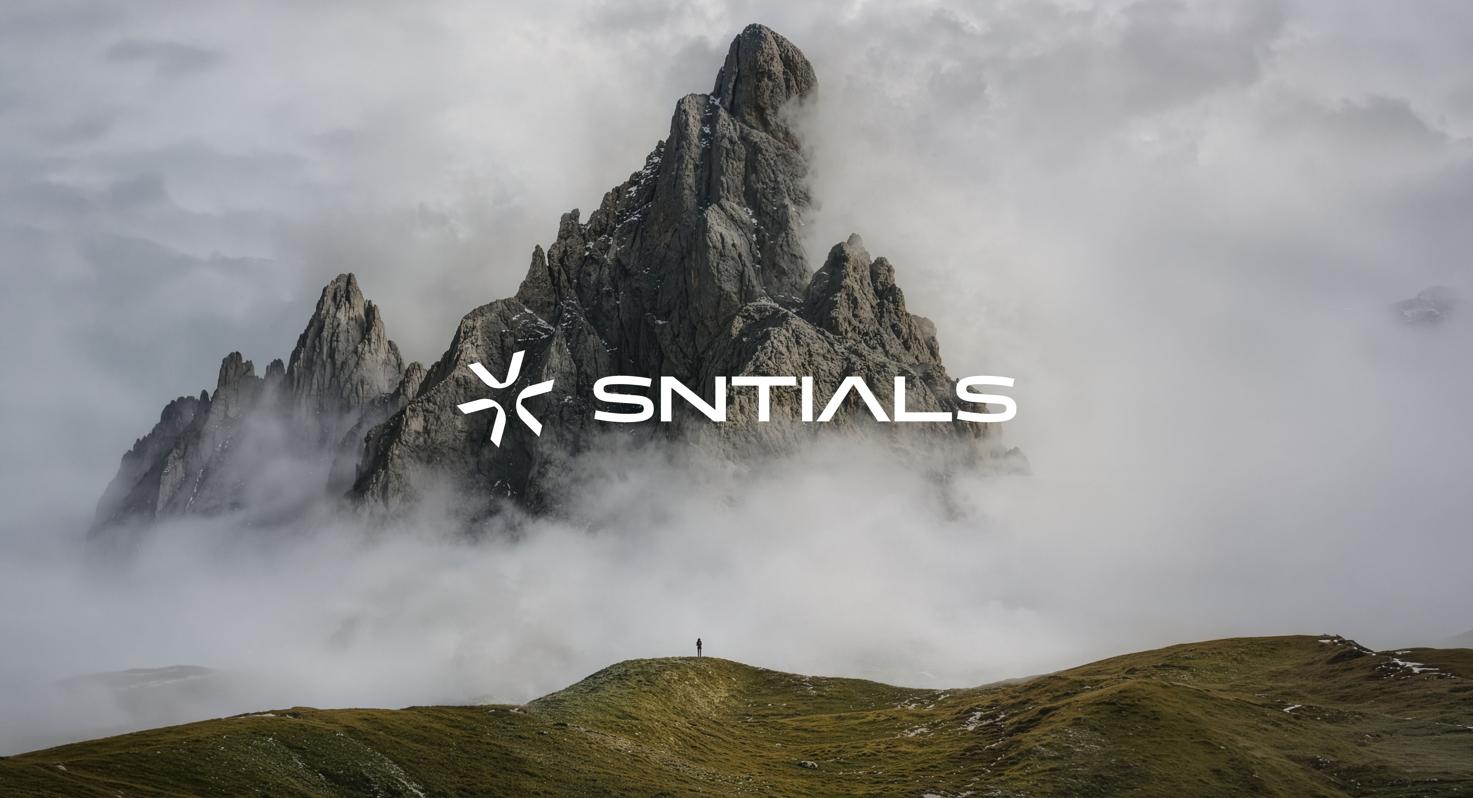
SNTIALS is an outdoor brand focused on essential function, sustainability, and minimal design. The brand is built on one belief: use only what you need. Its visual identity needed to say the same.
THE CHALLENGE
A brand built around leaving things out needs an identity that does the same. No extra elements and no decoration without a purpose. The challenge was to turn SNTIALS’ core idea into a visual language that feels technical and timeless.

THE SYMBOL
The symbol is made from three interlocking carabiners, shaped into a minimal mark. It represents connection, reliability, and the essential tools of the outdoors. It also expresses the brand’s philosophy: focus only on what matters.
LOGO AND TYPOGRAPHY
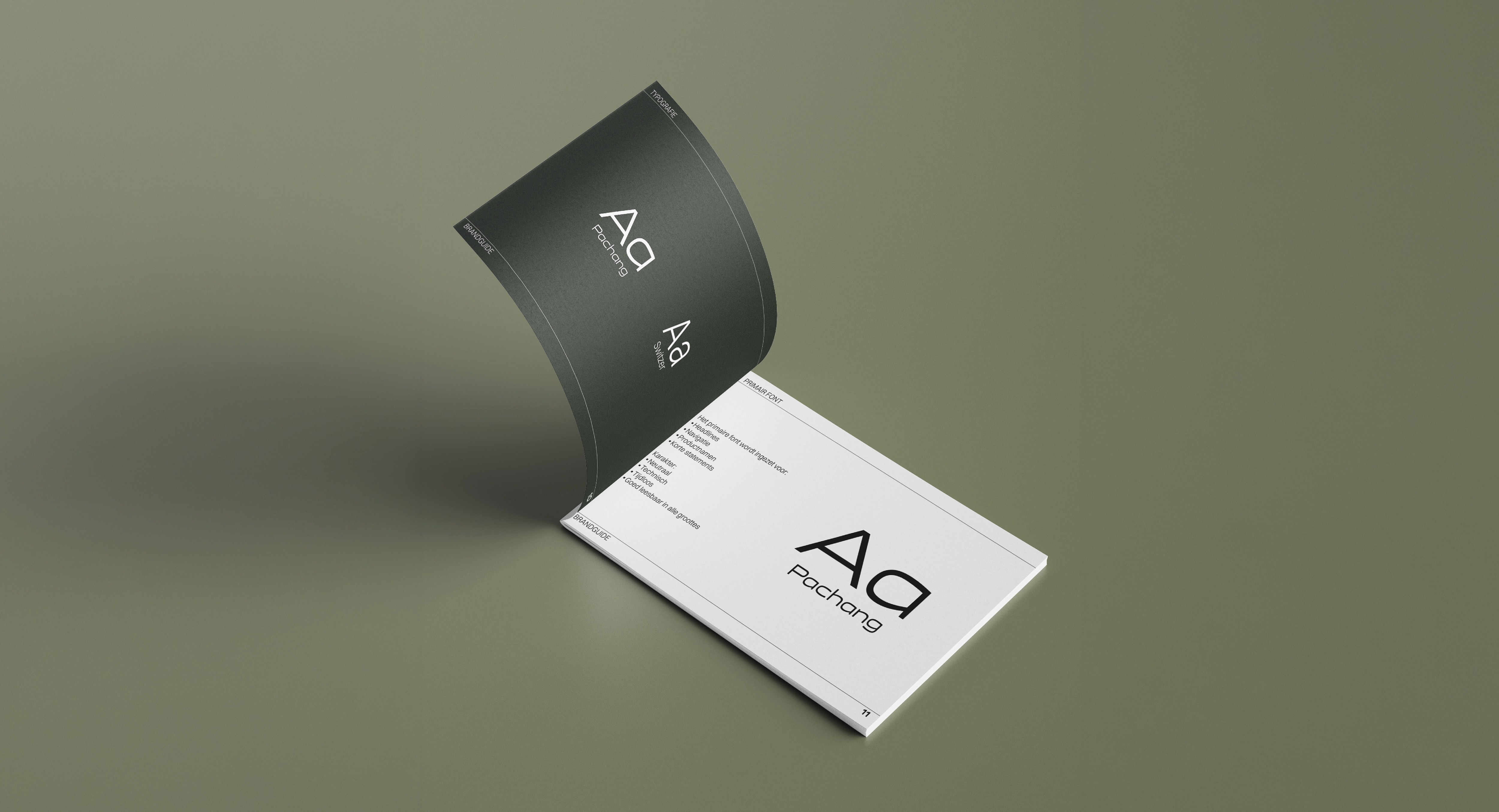
Together with a timeless wordmark and a structured type system, the symbol creates a strong, recognizable base. The typography reinforces the technical character of the brand: clean, functional, and without fuss.
COLOR PALETTE
The color system reflects the materials and environments of outdoor use: natural, durable, and consistent across every application.
VISUAL SYSTEM
From logo use and color application to typographic rules, every element works together and is ready for future communication, products, and campaigns.


THE RESULT
A clear, cohesive brand identity that reflects SNTIALS’ focus on essential outdoor function. A brand that feels technical, durable, and focused, with a strong base for what comes next.